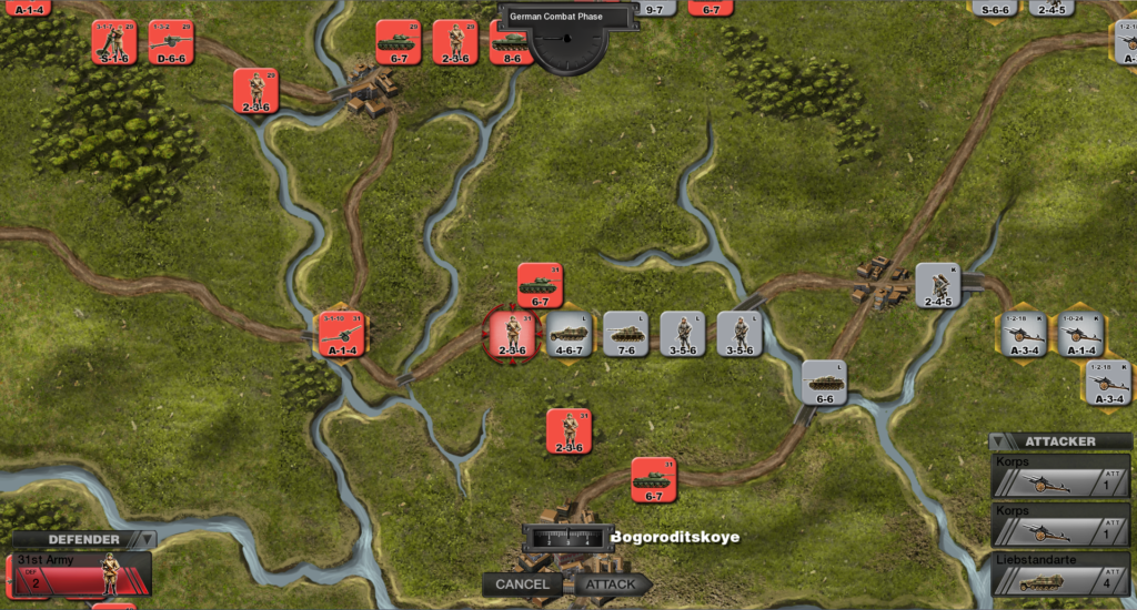
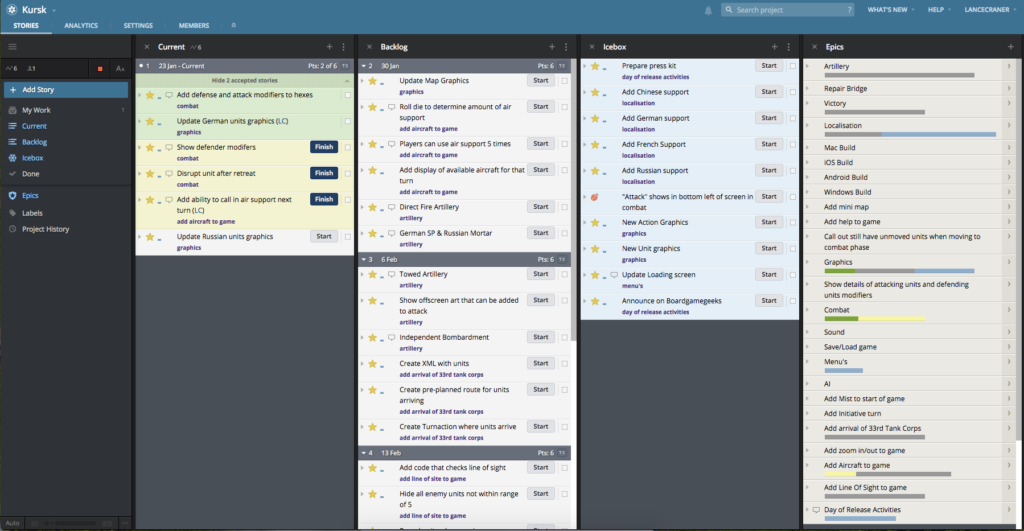
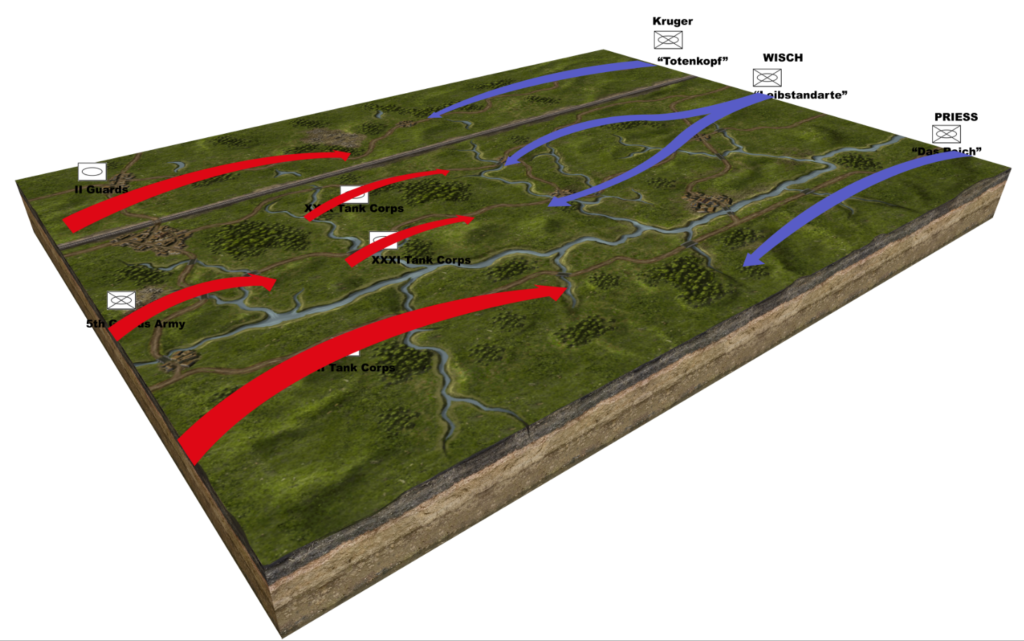
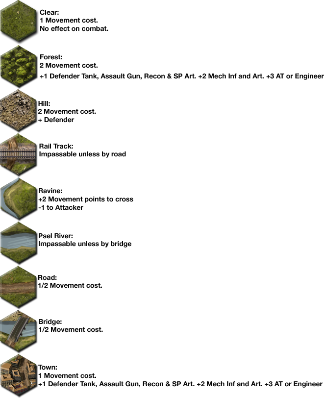
Finally I think “Kursk – Battle for Prochorovka” is ready primetime – or at least alpha time! Its time to get some feedback on the game as it is now while I work on the AI.
In the last week everything started to click into place. I fixed some bugs, got the game saving out and tweaked a few things and then suddenly it felt like it was ready for someone else to play with it and see what they think.
I spent most of today getting it uploaded to Steam with all the marketing and screenshots. Now I just need to wait 2 or 3 days for them to approve it and then I can publish it.
I decide to price it at $6.99 as the game is fully playable as is without the AI and I know for some people this will be enough. Full retail price will be $9.99 so I hope that people agree that a 30% reduction for not having AI in place is fair. I am sure there are a few bugs still to shake out but I need real people playing the game to find them when playing in a way I was not expecting.
One step closer to finding out if there is a market for this type of game. My expectations? I will happy if just a handful of people buy it.
